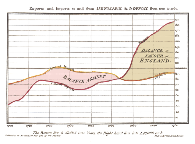
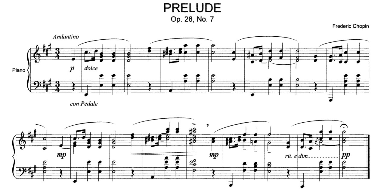
Wiliam Playfair (1759 – 1823)
In his words, commenting on how data were becoming ever more aboundant in life, and how data visualization (statistical diagrams) could help:
“And it is hoped,that with the assistance of these Charts, such information will be got, without the fatigue and trouble of studying the particulars of which it is composed.”
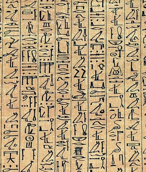
CURSIVE HIEROGLYPHS
Year: ~1250 BC
Photo: British Museum
Hieroglyphs originated as logographic symbols, and later evolved in syllabic and alphabetic elements, like these ones on the Papyrus of Ani.
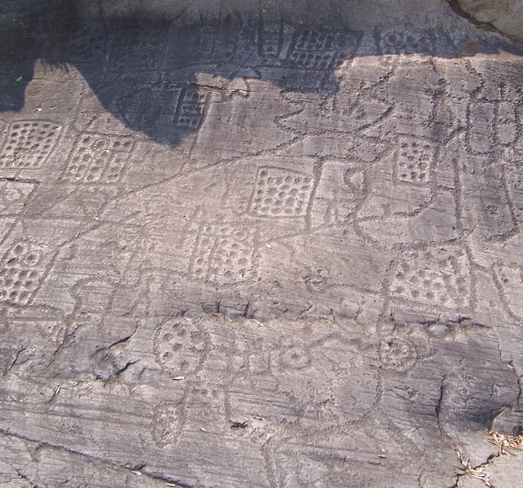
BEDOLINA MAP
Year: ~1000 BC
Photo: Luca Giarelli / CC-BY-SA 3.0
.jpg)
The Bedolina Map is one of the most ancient topographical map. It contains around 109 figures of paths, warriors, animals, and wooden huts.
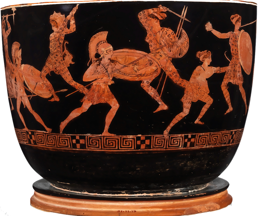
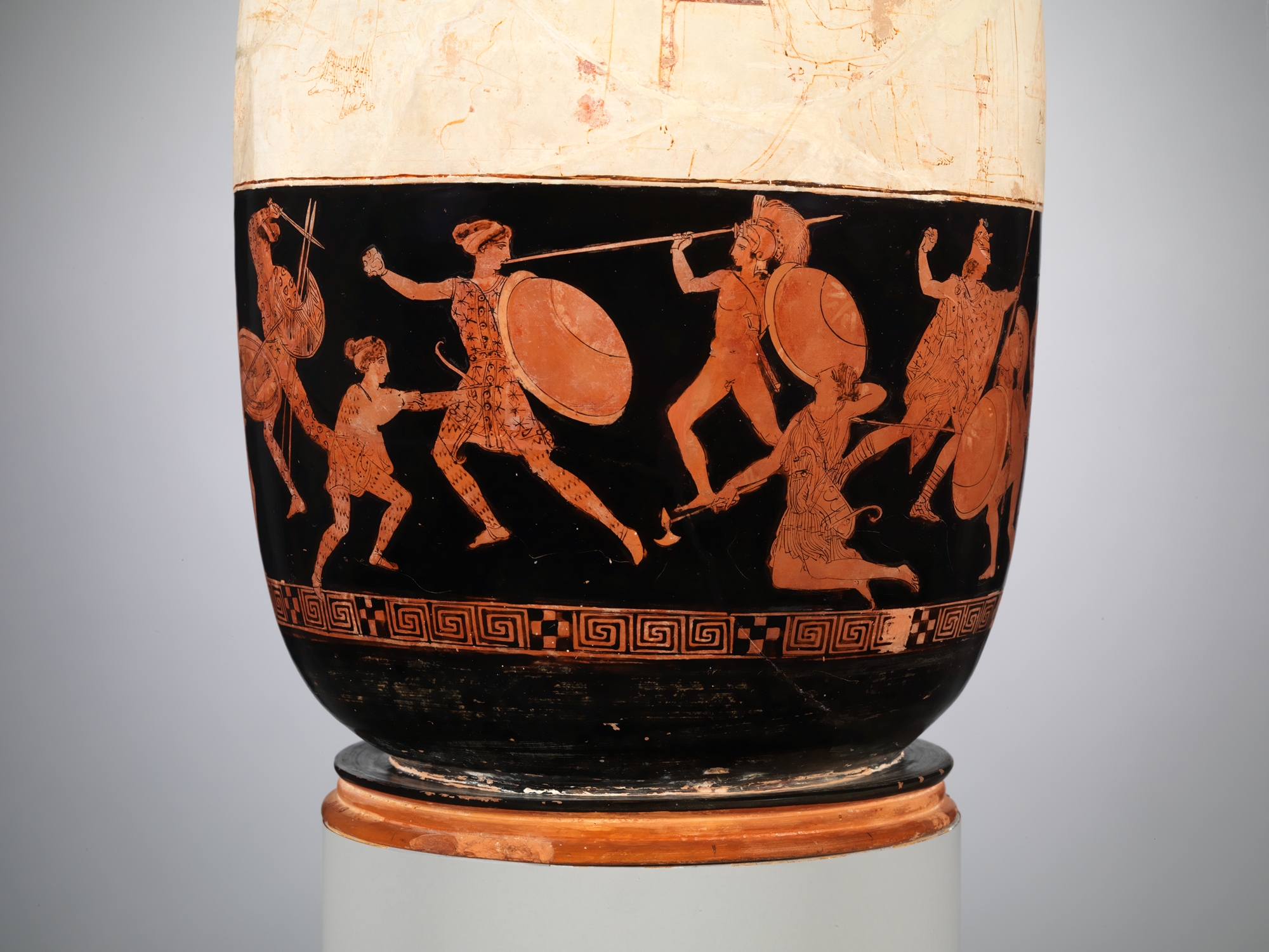
TERRACOTTA LEKYTHOS
Year: ~420 BC
Photo: MET Museum
Mythological stories where told visually on terracotta flasks in Ancient Greece; such as this one, telling of Theseus and Hippolyte fighting Greeks and Amazons
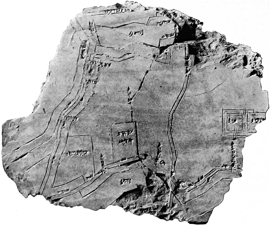
CLAY MAP OF NIPPUR
Year: ~1400 BC
Photo: Hilprecht, H. V.
In ancient Babylonia, maps were accurately drawn on clay tablets.
Is a map an abstraction? One have to argue that what’s represented in a map is definitely observable in real life, at least in theory. Though, very few of the people drawing maps had the chance to. They relied on measurements and data, representing them on the Cartesian plane.
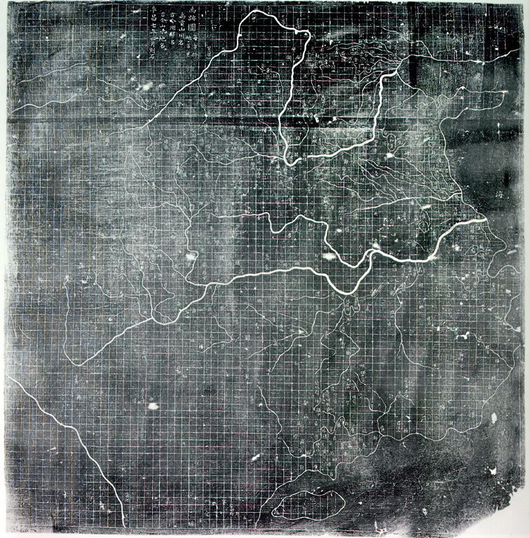
SONG DINASTY MAP
Year: 1137 AD
Media: Impression of Carved Stone
The Yu Ji Tu (Map of the Tracks of Yu the Great) represents the coastal line and rivers of China in a gridded Cartesian plane, with elevated precision.
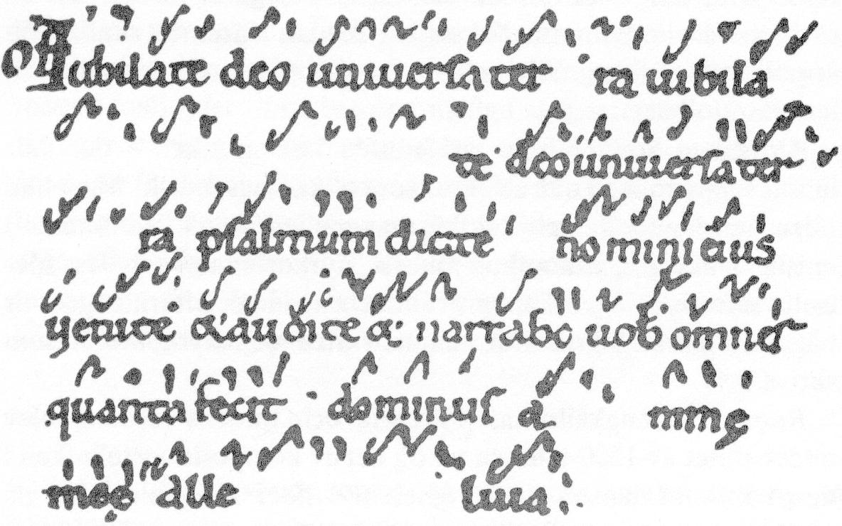
MUSICAL NEUMES
Year: ~900 AD
Topic: Gregorian Chant
Musical Neumes are one of the earliest graphical representation of music, drawing over vowels would represent the pitch and modulation in which the text should be sung.
STAFF MUSICAL NOTATION
Year: Current
The staff musical notation, was developed in the last 1000 years. It represents graphically pitch timing and modulation of music, across 5 parallel lines.
Colud it be one of the first way to abstract data and then represent them graphically in a new way?
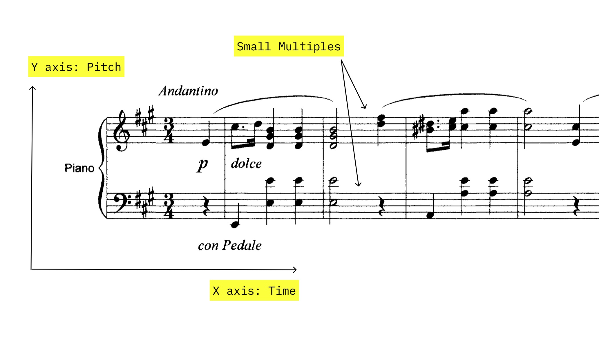
This Longitudinal Distance Chart represents separate measurements of the distance between Toledo and Rome. Each measurement is a labelled point on a x-axis of a one-dimensinal chart. All measurements overestimate the real distance, which is at ~16˚.
This chart contains so many ideas and concepts at once. The idea that measurements contain an error, that they can be repeated and pooled to infer this error, that they can be represented graphically to inspect this error using visual perception.
The x-axis is well defined and labelled, the points show each single measurement, and are labelled also, the title is inserted in the empty space.
SURVIVAL PLOT
Year: 1669
Author: Christiaan Huygens
This density plot shows the age on the x-axis and the survival probability on the y-axis. Huygens estimated Survival probabilities from John Gaunt’s life expectancy data in London.
The graphs doesn’t show data points but an empirical probability density.
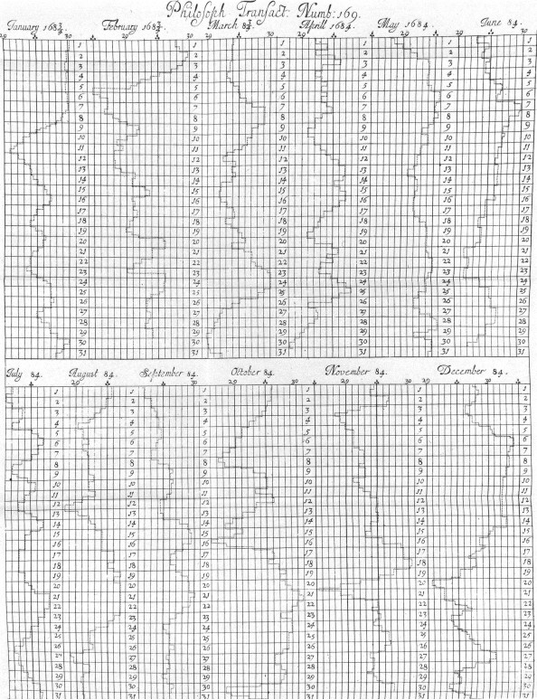
WEATHER HISTORY
Year: 1685
Author: Robert Plot
A vertical line plot of the barometric pressure in Oxford for the year 1684.
This 2-dimensional line plot shows the data for each day of one solar year in two lines of facets.
GRAPHIC TABLE
Year: 1737
Author: Johann Heinrich Lambert
The temperature is represented on the x axis, while the y axis represents the month of the year. Lambert binned the data by this two variables, and counted how many days fell into each bin.
Lambert positioned number in space based on the mappings of the x and y axis. Today we are used to map a color intensity to the count numeric value, in what would become a heatmap.
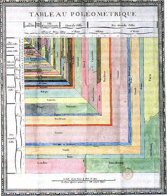
TABLEAU POLÉMETRIQUE
Year: 1782
Author: Charles-René de Fourcroy de Ramecourt.
In this polymetric table the area of each polygon is proportional to the population of the main European cities.
This is one of the first treemaps, in which the area of polygons is mapped to data, and then the polygons are fit in space of the page.
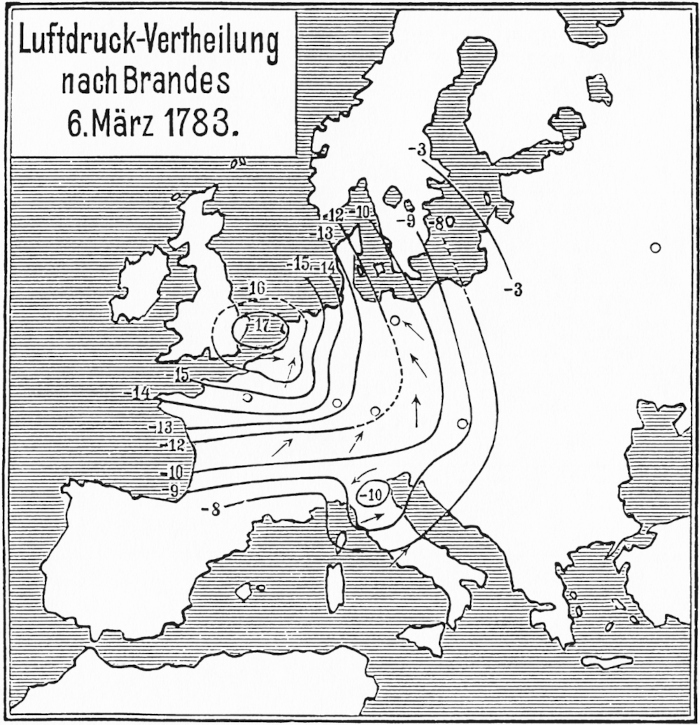
WEATHER MAP
Year: 1816
Author: Heinrich Wilhelm Brandes
The first weather map, showing data collected from 1783. Brandes overlaid isobar lines over the map of Europe.
This map introduces isolines, which are lines that connect points with the same value over a continuous gradient.
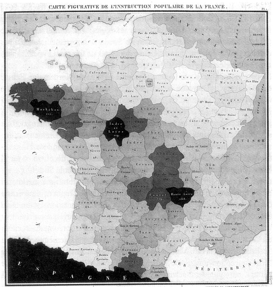
CHOROPLETH MAP
Year: 1826
Author: Charles Dupin.
Dupin used shades of dark to overlay the level of education, stratified by region, on the administrative map of France. This approach is now known as choropleth map.
In this choropleth map, the darker the region the higher is the average education level.
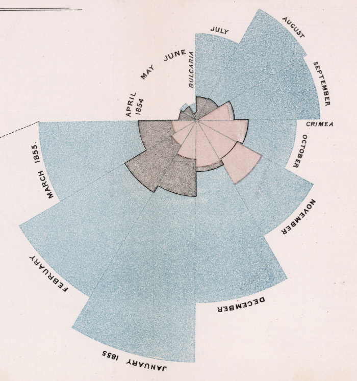
RADIAL HISTOGRAM
Year: 1858
Author: Florence Nightingale.
Nightingale used this radial stacked histogram to show hospital death causes in the Crimean war of 1854-1855
Aimed a the Queen Victoria and policy makers, this chart showed a peak of deaths from infectious diseases (light blue) during winter months in military hospitals. Florence Nightingale regarded these deaths as preventable, and used this chart to argue for the need of basic sanitation practices, such as air circulation.
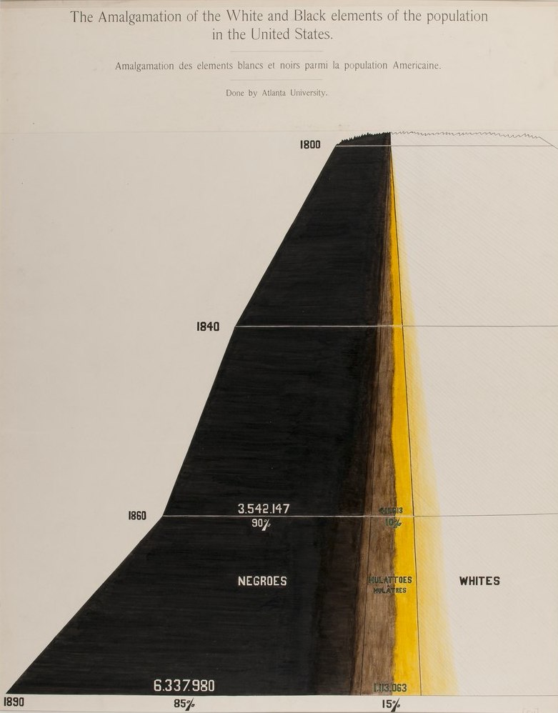
COMMEMORATION OF AFRICAN AMERICANS
Year: 1900
Author: W. E. B. Dubois
Time is represented on the y-axis; the size of the path on the x-axis represents populations size. The colors show how to ethnic groups slowly mix together
an American-born Ghanaian sociologist, socialist, historian, and Pan-Africanist civil rights activist. At the universal exposition of Paris, in 1990 he collected photos and charts on the life of African Americans, to challenge stereotypes.
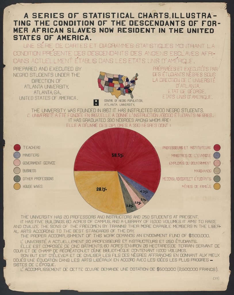
COMMEMORATION OF AFRICAN AMERICANS
Year: 1900
Author: W. E. B. Dubois
Dubois’ work of data visualization for information and storytelling is a great example of clear and easy-to-read charts prepared with an assertive and impactful style.