Show the Data
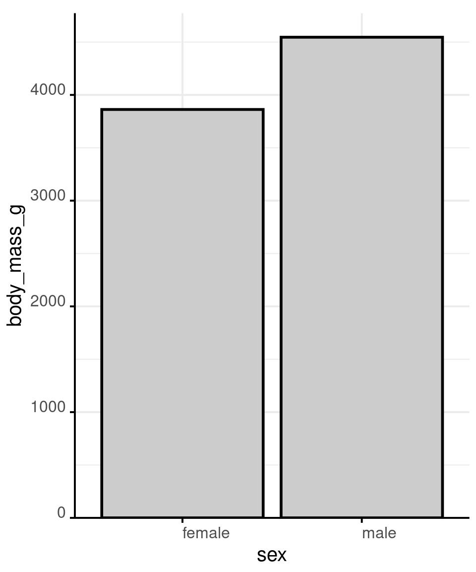
Show the Data
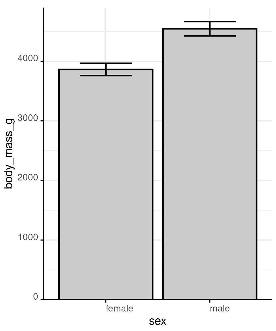
# showing mean and
# confidence interval
# is generally accepted,
# but it still hides most
# of the information
penguins %>%
  drop_na(sex) %>%
  ggplot() +
  aes(x = sex,
      y = body_mass_g) +
  stat_summary(
    fun = mean,
    geom = 'bar',
    colour = 'black',
    fill = 'grey80',
    size = 1
    ) +
  stat_summary(
    fun.data = mean_cl_normal,
    geom = 'errorbar',
    colour = 'black',
    size = 1,
    width = .5
    ) +
  scale_y_continuous(
    expand = expansion(
      mult = c(0, .05)
    )
  )
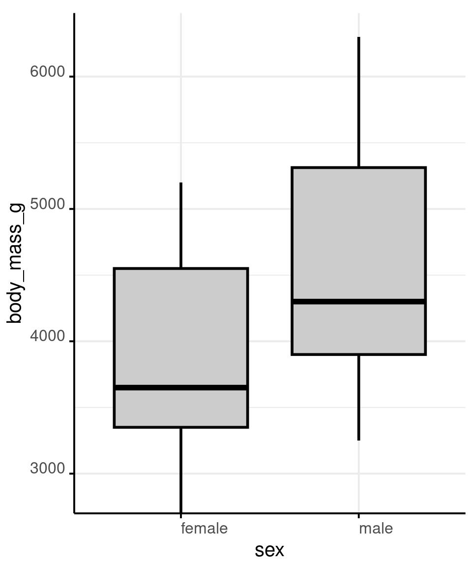
Show the Data
# A boxplot shows intuitive and
# robust statistics
# When we switch to this visual
# model, ggplot automatically cuts
# the axis to highlight relative
# comparisons
penguins %>%
  drop_na() %>%
  ggplot() +
  aes(x = sex,
      y = body_mass_g) +
  geom_boxplot(
    colour = 'black',
    fill = 'grey80',
    size = 1
    ) +
  scale_y_continuous(
    expand = expansion(
      mult = c(0, .05)
    )
  )
Show the Data
Show the Data
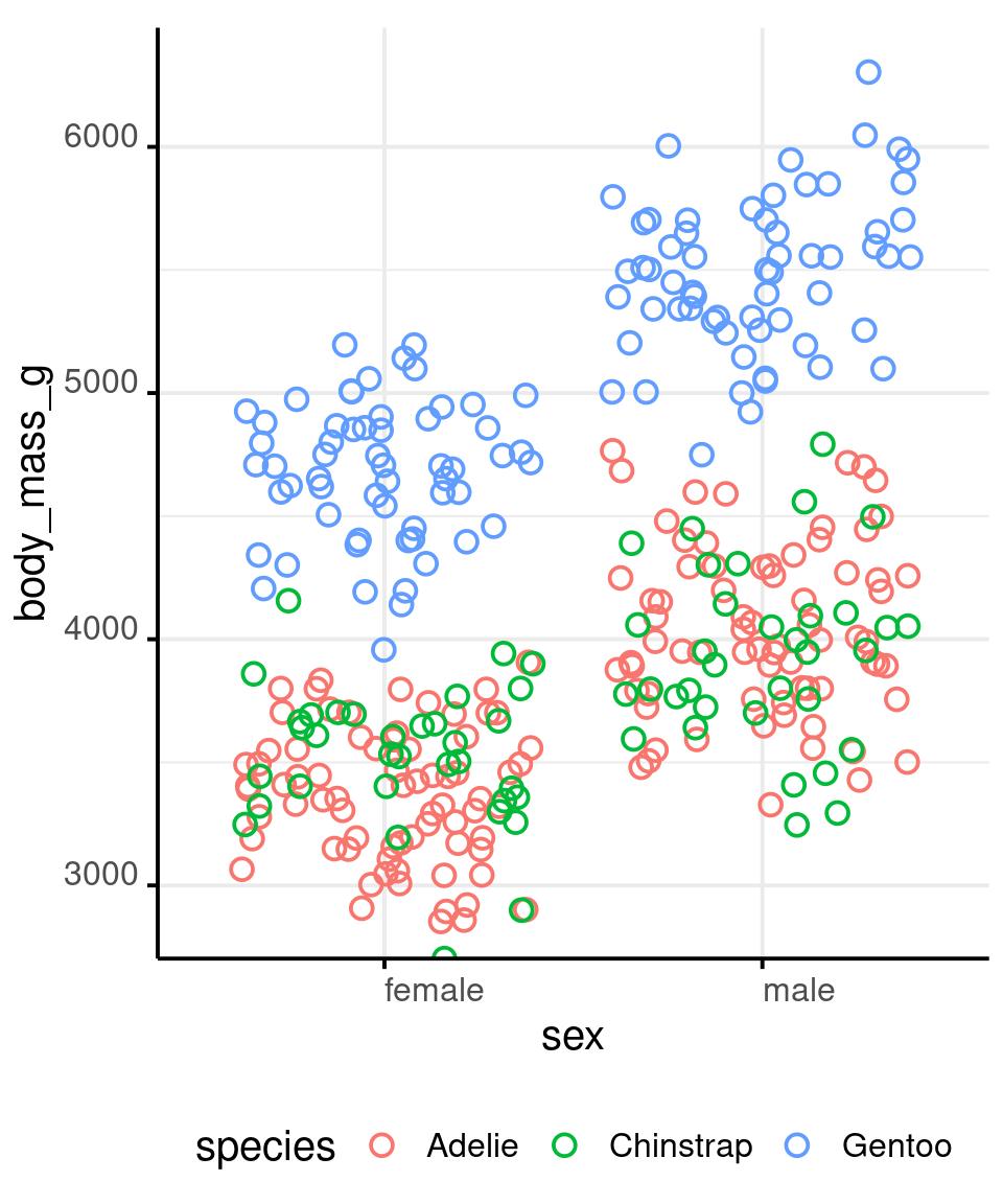
Show the Data
penguins %>%
  drop_na() %>%
  ggplot() +
  aes(x = sex,
      y = body_mass_g,
      colour = species,
      shape = species) +
  geom_jitter(
    shape = 1,
    size = 3,
    stroke = 1
    ) +
  stat_summary(
    fun = median,
    geom = 'point',
    shape = '_',
    size = 20,
    colour = 'black'
  ) +
  facet_grid(
    cols = vars(species)
  ) +
  scale_y_continuous(
    expand = expansion(
      mult = c(0, .05)
    )
) 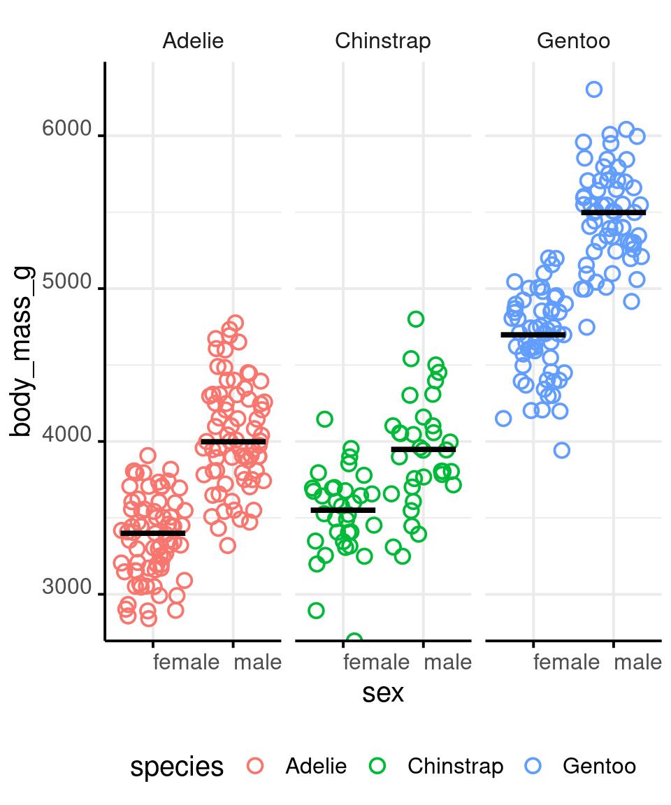
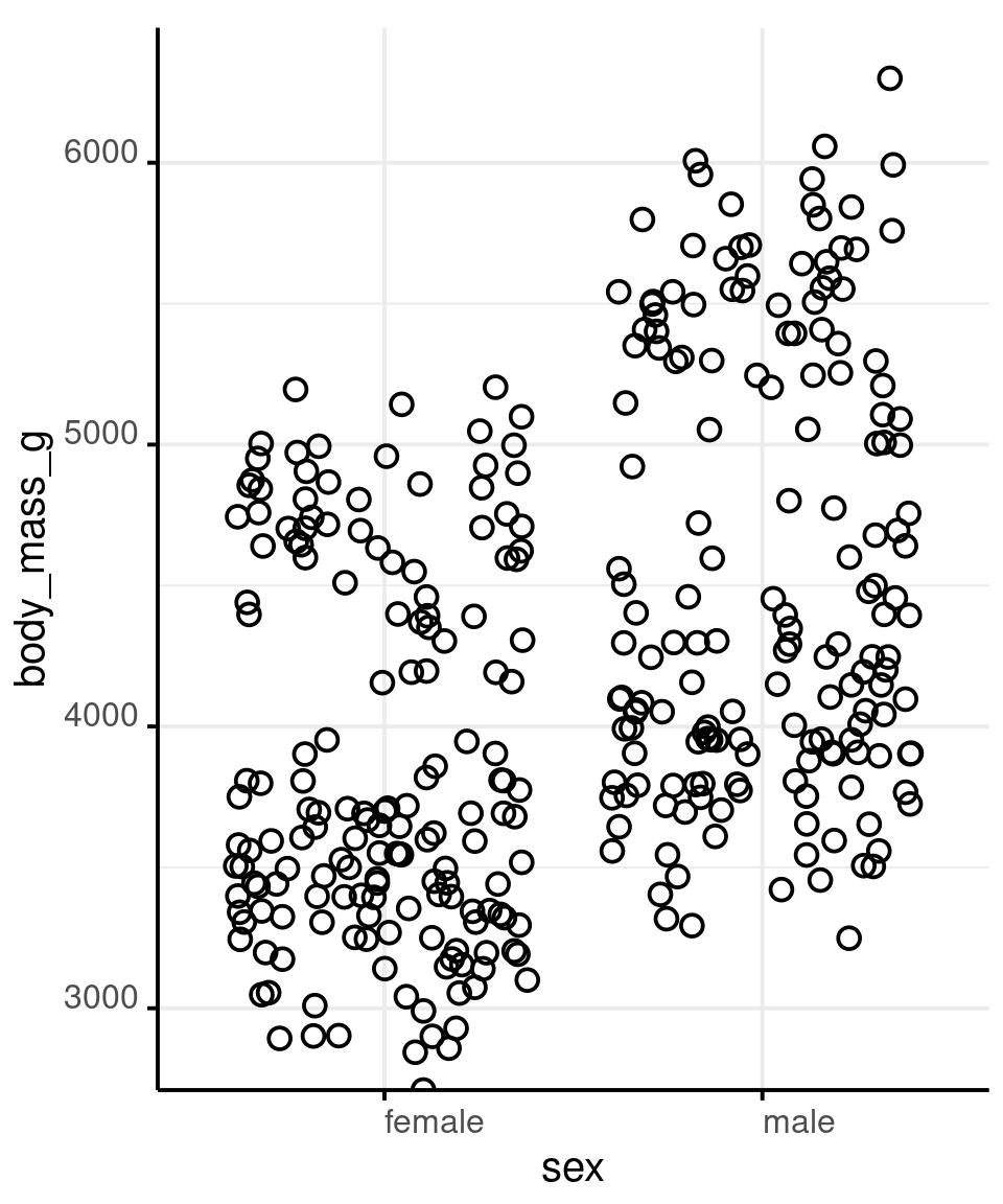
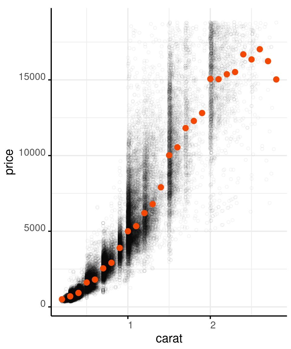
Show as Much Data as You Can
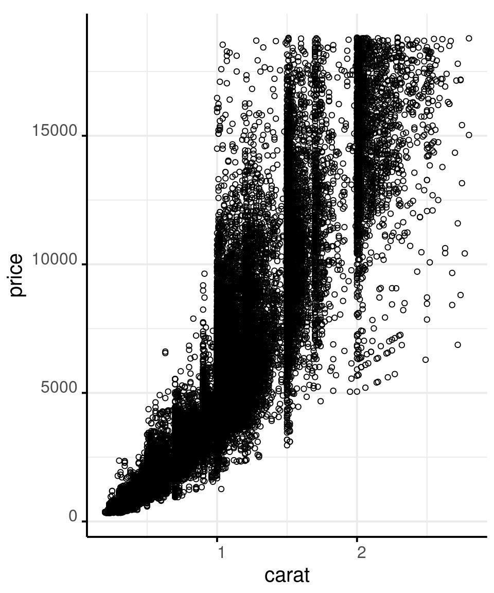
Show as Much Data as You Can
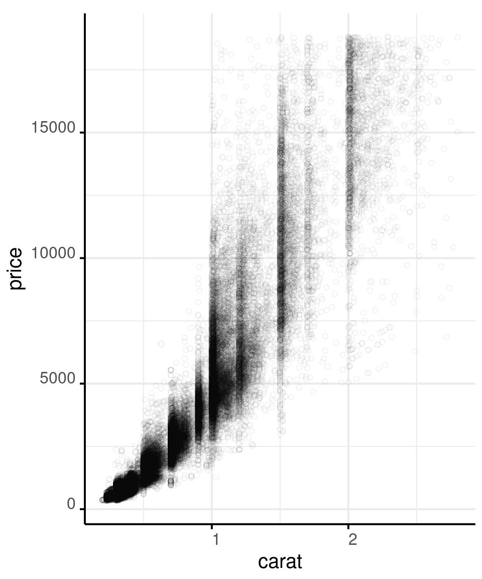
Show as Much Data as You Can
# And add a red point that shows a robust
# summary of the data: the median
# of price over binned carat
diamonds %>%
  filter(carat < 3) %>%
  ggplot() +
  aes(x = carat,
      y = price) +
  geom_point(shape = 1,
             alpha = .05) +
  stat_summary(
    aes(
      x = carat %>% round(1)
    ),
    fun = median,
    colour = '#f44702',
    geom = 'point',
    size = 3
  )
DATA TO INK RATIO
Year: 1983
Author: Edward Tufte.
Edward Tufte shows that removing ink from axes and other graphical elements that are not directly mapped to the data, the message of the graph might become more evident.
Checking the data to ink ratio of your graphs is a good way to help your message stand out.
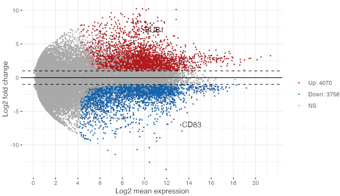
A highly specialized diagnostic visual model used in the omics disciplines.
The MA plots shows the average expression level against the log fold change in multiple parallel measurements between two conditions.
When you compare the expression levels of several transcripts, such as with a transcriptomic experiment, you expect few genes to be differentially expressed.
With the MA plot you can check if this assumption is supported by the data, or you can detect normalization issues.
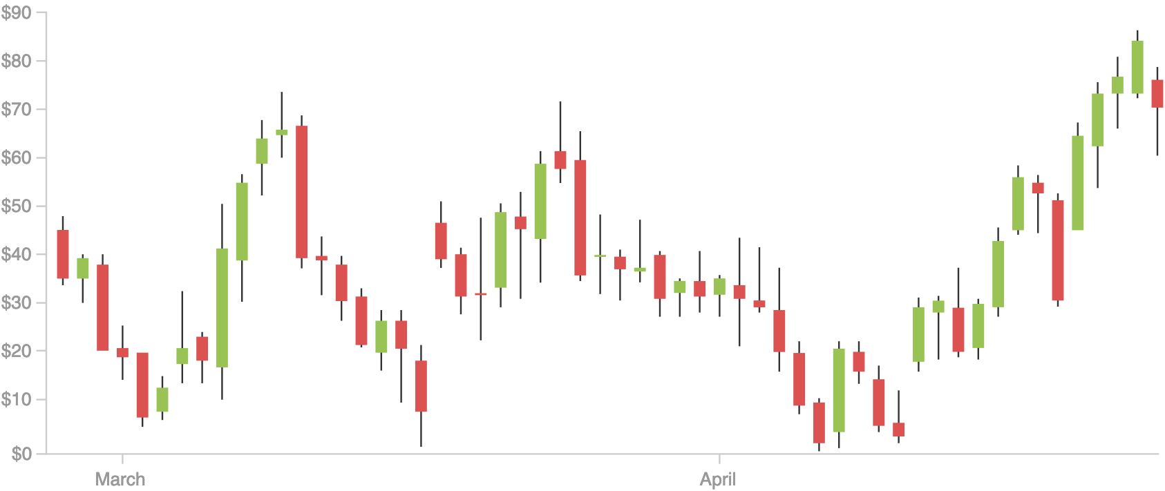
A quick way to check if the stocks values increased or decreased between the opening and the closing of given day, and to check also the highest and the lowest value that they reached
For each day, the box represents the opening and the closing value, and the whiskers represent the highest and the lowest value of the stock. The color shows if the stock value increased or decreased during the day.
This graph is similar to a boxplot, but represents different values.
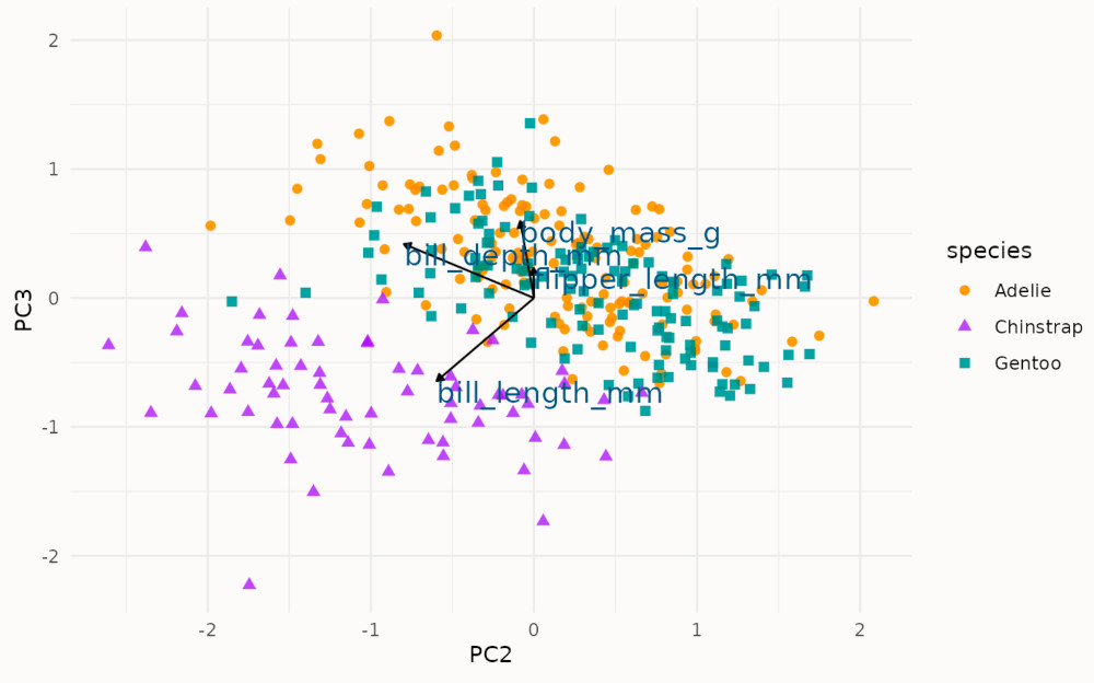
A way to display, together, the loadings and projections of the first two components while performing a principal component analysis.
This graphs overlay two information: the projected data are shown as a scatterplot, and the loadings are shown as arrows starting from the center.
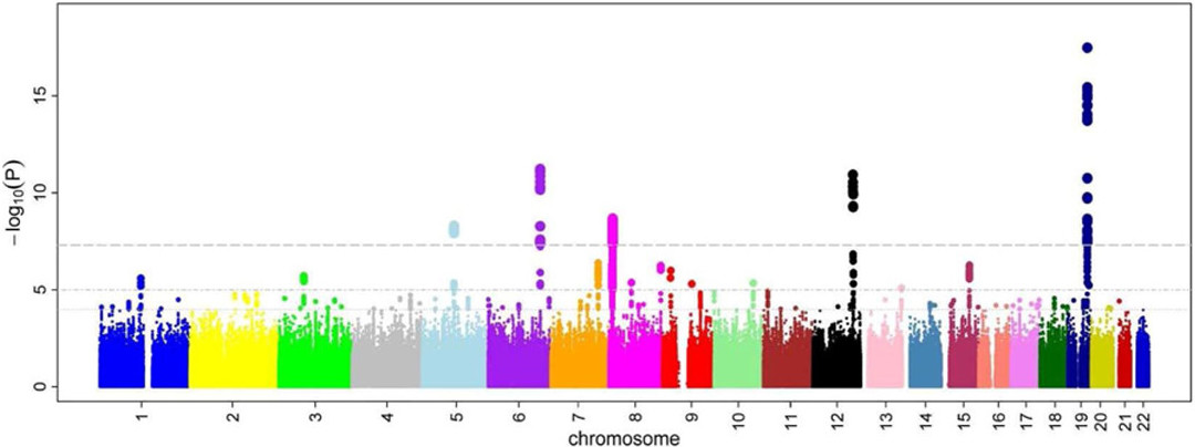
MANHATTAN PLOT
Source: Wikimedia Commons - M. Kamran Ikram et al
Field: Genomics / Genome Wide Association Studies
Across all chromosomes, which genetic marker is statistically associated with a phenotypic trait or an illness?
The x axis represents the loci, the position across all chromosomes, which are displayed by color. The y axis represents the minus log p-value of the association test between the loci and the phenotypic trait which is being studied.
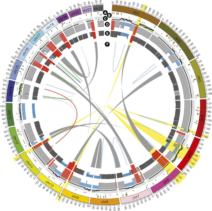
CIRCULAR CHORD PLOT - GENOMICS
Source: Gupta et al., 2015, PNAS
Field: Genomics / Evolution
Circular Plots are often used in genomics to represent translocation and rearrangements of chromosome fragments across the chromosome of an organism. In general, circular visual models are very common in genomics.
The outer ring represents the chromosomes, the inner ring represents genomic rearrangements. The main axis, x, mapped to the position on the chromosome, and is represented by an angle, generally named theta, on polar coordinates.
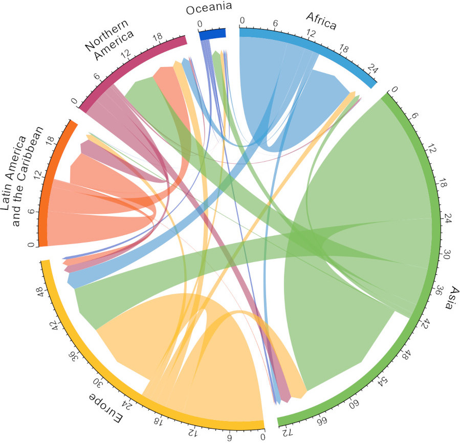
CIRCULAR CHORD PLOT - MIGRATIONS
Source: Guy J. Abel - migest R package
Field: Humanitarian Studies / Migration
The same specialized visual model, can be used to represent analogous phenomenon across multiple disciplines, in this case the circular chord plot is used to represent migrations within and across continents.
The outer ring represents the scale of the migration by continent. The size of the migration is represented on the x axis and it is mapped to the theta angle in polar coordinates. The inner ring represent the direction and size of the migration.
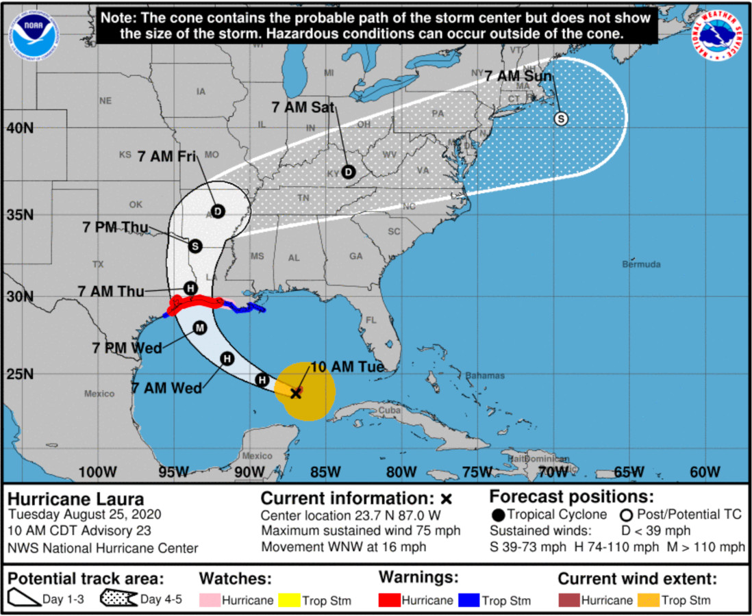
HURRICANE PROBABILITY CONE
Source: NOAA - Hurricane Center
Field: Weather Forecast / Hurricane Warning
The uncertainty of the hurricane’s path is mapped to the cone. There’s evidence that, instead, we intuitively associate the size of the cone to the forecasted size of the hurricane, which we perceive as getting bigger with time.
The cone shows the foretasted path of the hurricane, from its current position. The size of the cone grows with the uncertainty in the path’s forecast
Basic Perception
Nevertheless, there are fundamental perception experiments that tell us how accurately we tent to read different shapes of visual information.
If you want to study this topic, a great place to start is Kennedy Elliot’s blog post: 39 studies about human perception in 30 minutes.